CASE STUDY 05 · B2B PLATFORM
HR Tech with Empathy
A three-sided platform connecting employees, managers, and experts around life's biggest moments — designed so each side sees exactly as much as it needs to.
CASE STUDY 05 · B2B PLATFORM
A three-sided platform connecting employees, managers, and experts around life's biggest moments — designed so each side sees exactly as much as it needs to.
44%
of managers rank combating team burnout and balancing workloads as their #1 challenge — with no training for the personal moments underneath it.
49%
of employees have quit a job because their boss wasn't empathetic to what was happening in their personal life.
Neither side had a system for this; they had improvisation.
While still working through wireframes, we mapped this flow end-to-end, prioritizing the employee-expert interaction first. It carries the most sensitivity of any exchange in the product.
Employees needed two different things here: a way to let the right people know something was going on without over-explaining it, and a way to find support that actually matched their situation — quickly, without guessing which category fit.
Sharing a life event is meant to feel like a safe space, not a task to manage alone. What Villyge takes over is the daunting part — telling the manager, and equipping them with guidance for that specific situation.
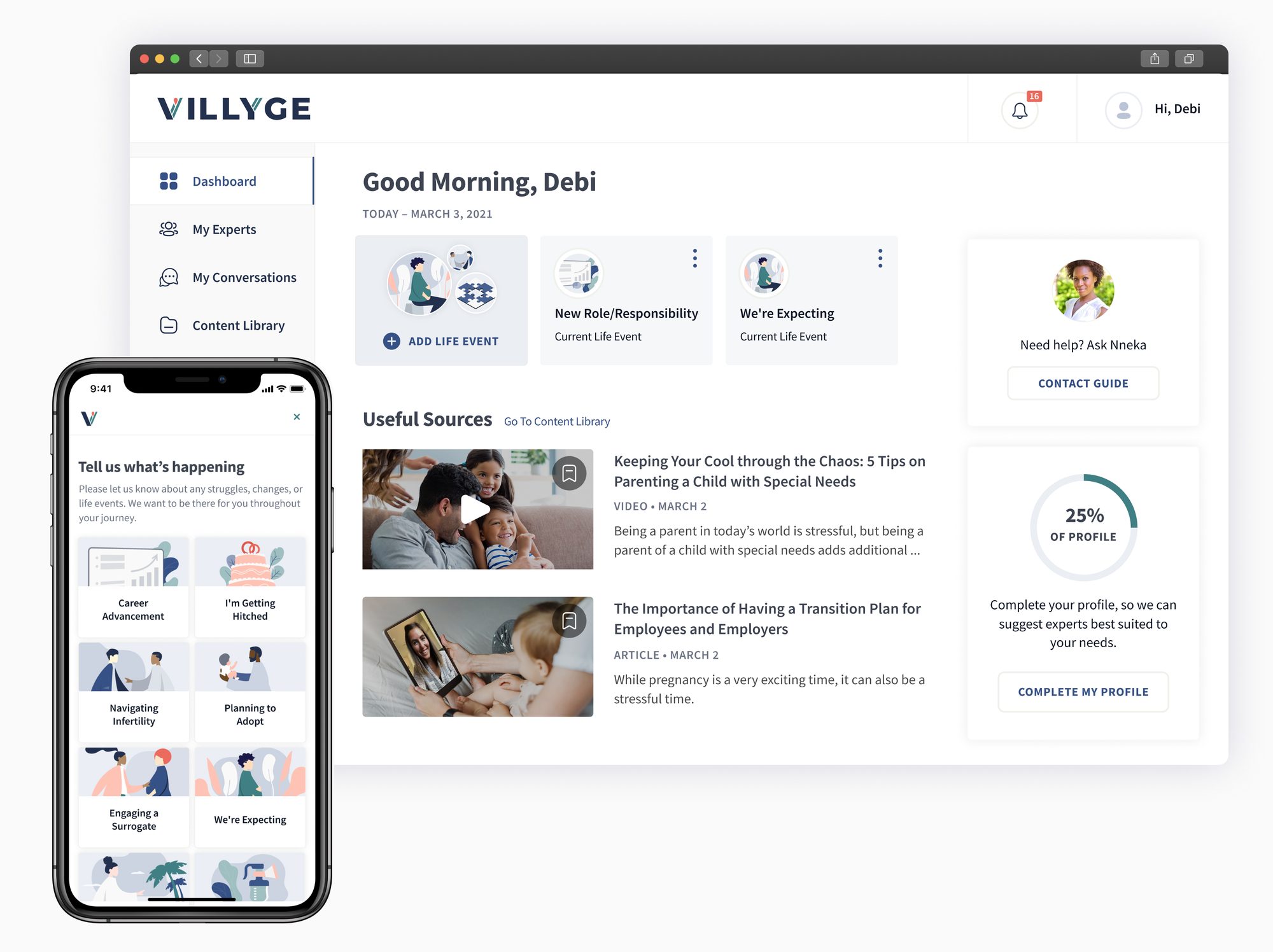
From there, the flow narrows fast: pick a category, get matched to an expert, pick a time. Three steps, no dead ends.
The employee picks a category — the kind of support they're looking for.
They're matched to an expert based on that category.
They pick a time that works — sooner if it's urgent.
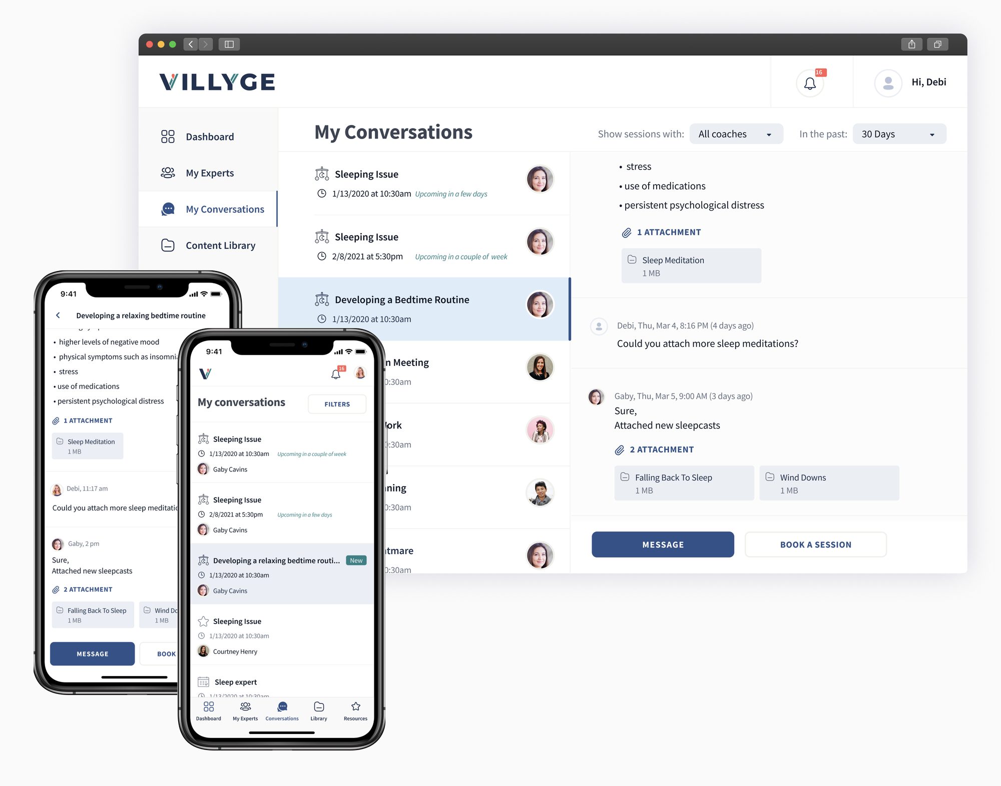
The thread with an expert stays put, and the same event feeds a content library and the option to keep working with that expert going forward.
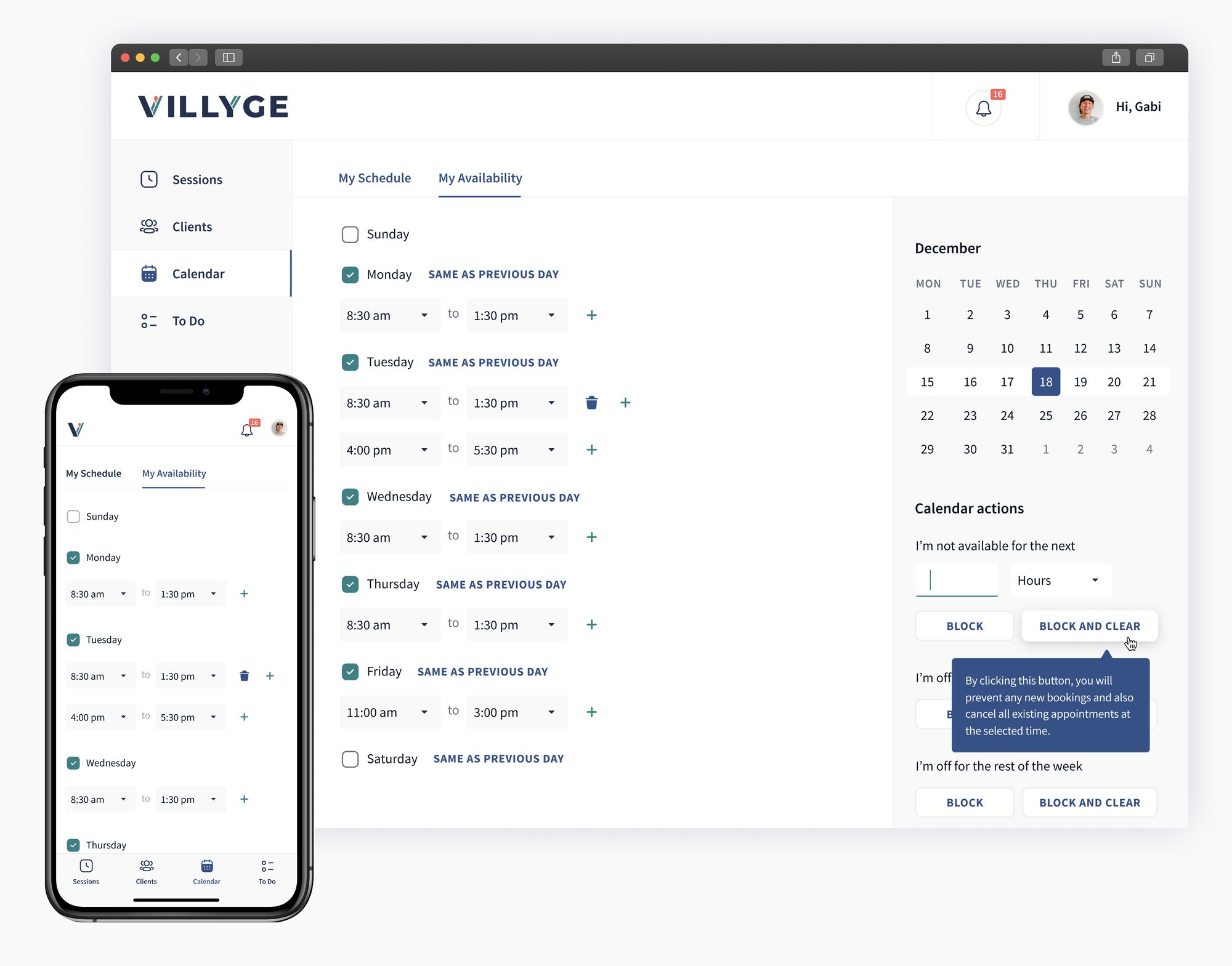
Experts needed to feel like they were running their own practice inside the platform, not just filling slots someone else controlled. So they got their own availability, a synced calendar, a full client list, and their own to-do list — the same idea as the manager's checklists, but one they fill in themselves.
Experts set their own hours and sync them against a personal calendar, so Villyge never double-books them.
Experts move between month, week, and day without losing context.
Zoom into a single day for hour-by-hour detail.
Line up sessions day by day across the working week.
See the whole month at a glance to spot open stretches.
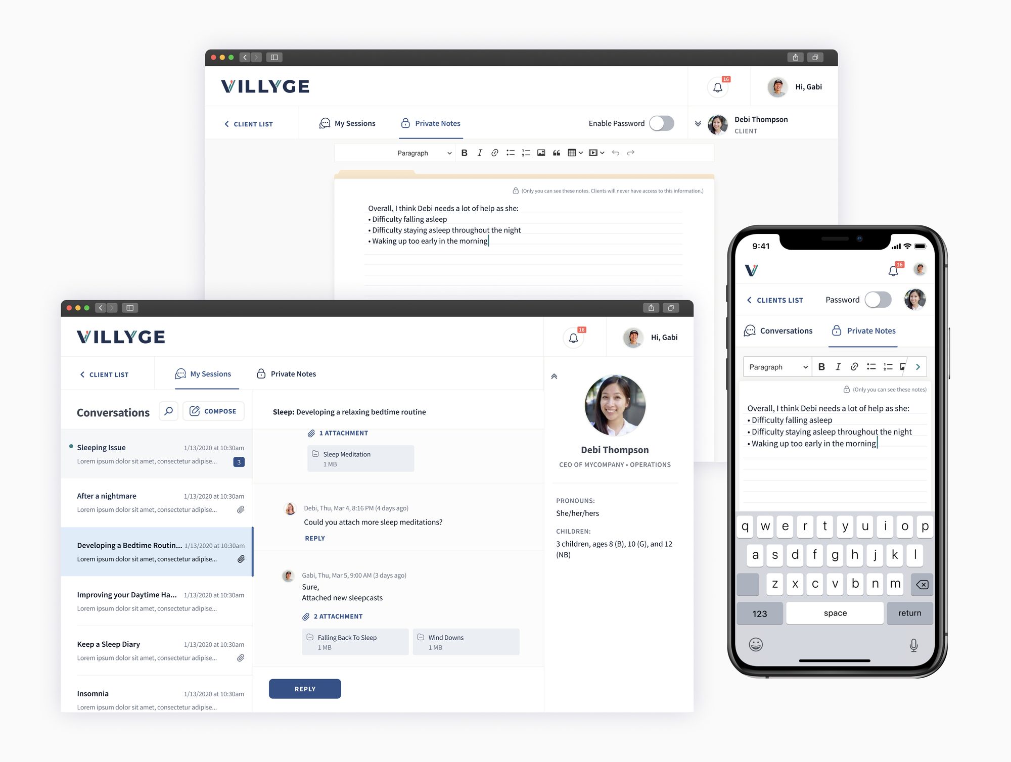
Clicking into a client opens their conversation thread alongside a private notes panel — a folder only the coach can see. In usability testing, coaches asked for a way to lock that folder further, so it can optionally be protected with its own password, separate from account login.
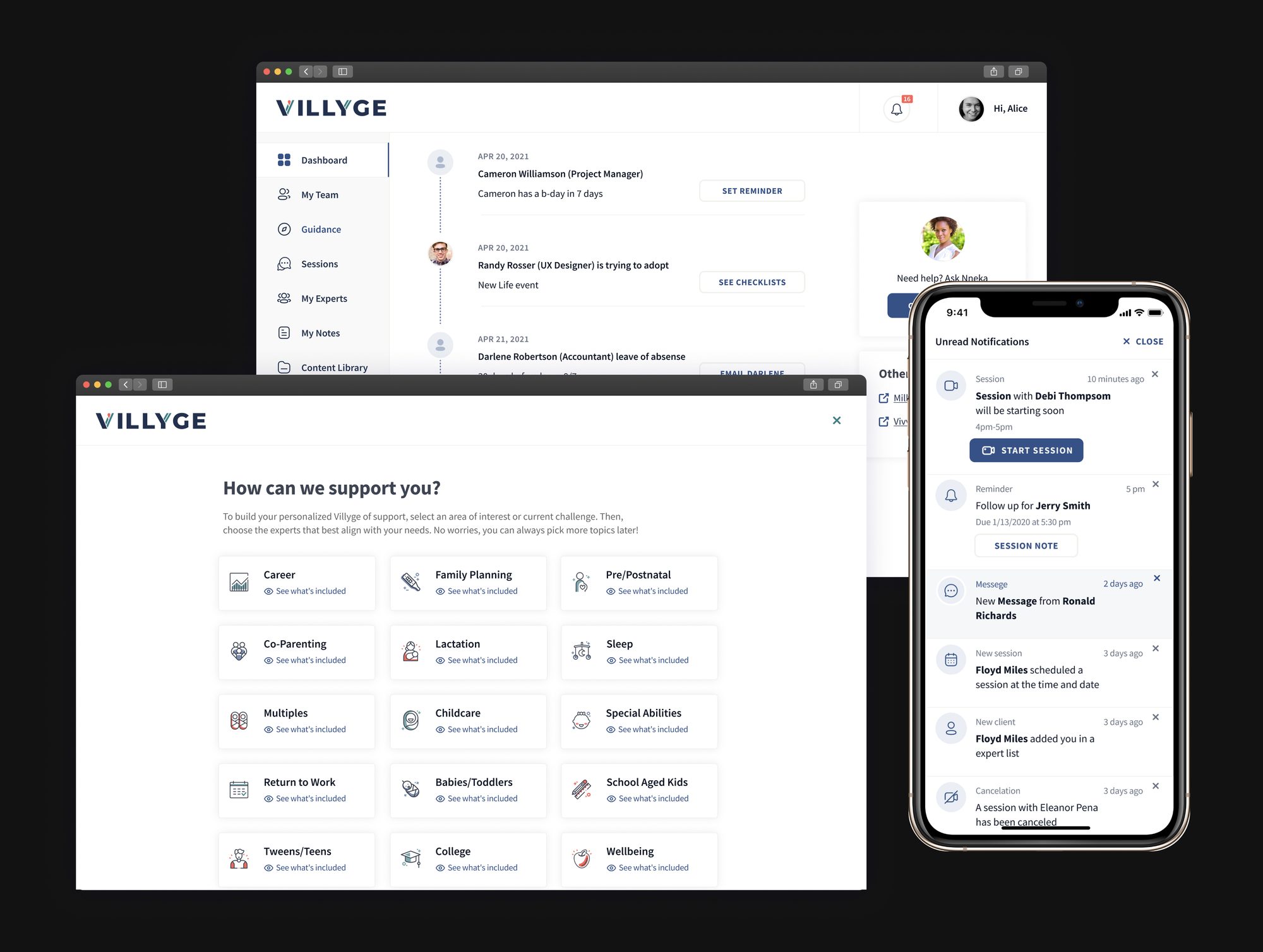
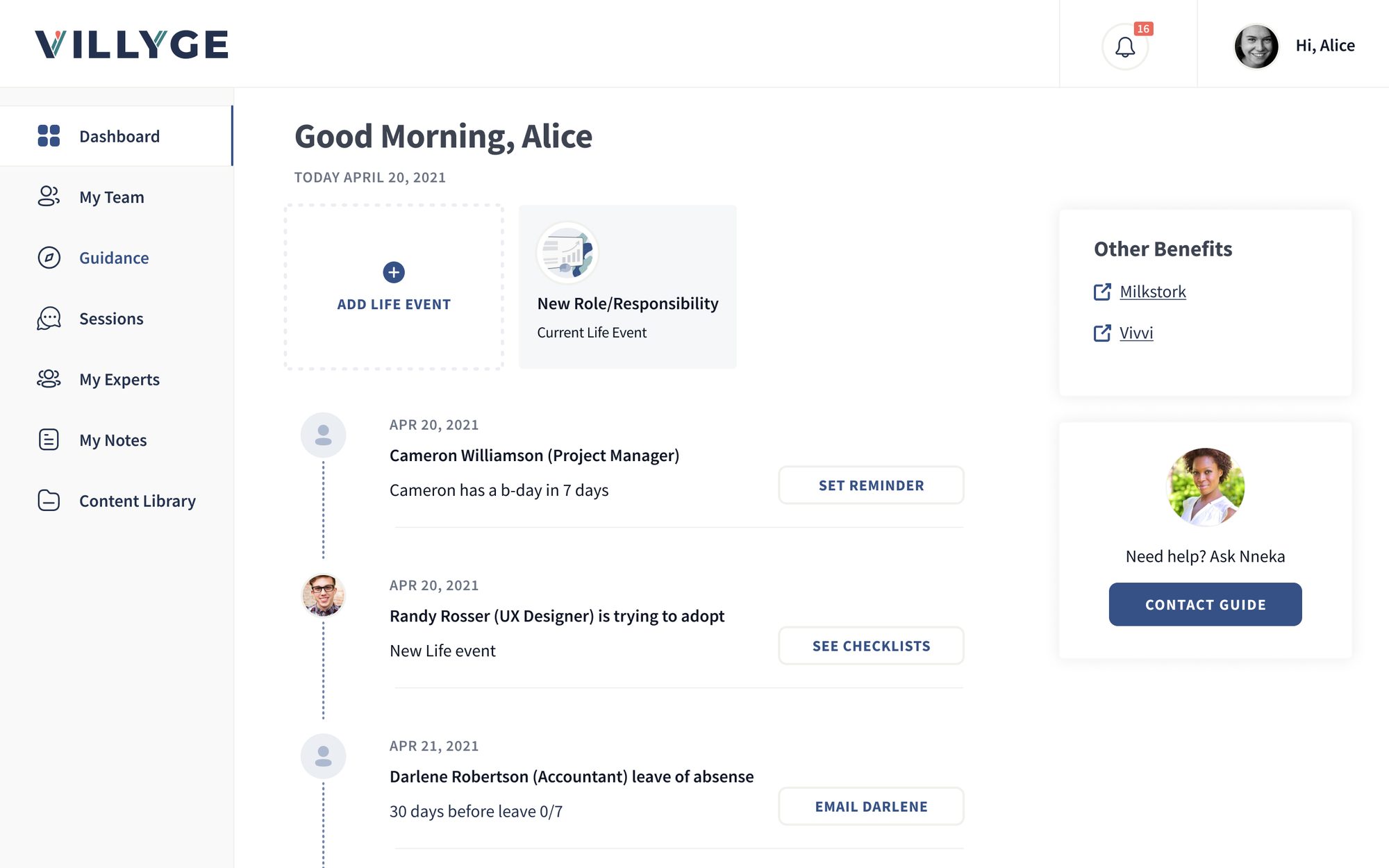
This is the real design problem in the whole product: a manager needs to know enough to act — send a check-in, adjust a deadline — without ever seeing the private detail an employee disclosed. The dashboard surfaces a nudge and an action; it never surfaces the note itself.
The dashboard reads like a feed: each teammate's moment — a birthday, a new life event, a training reminder — paired with a single next action, like sending a reminder or opening a checklist. It's built to surface what to do, never the private note behind it.
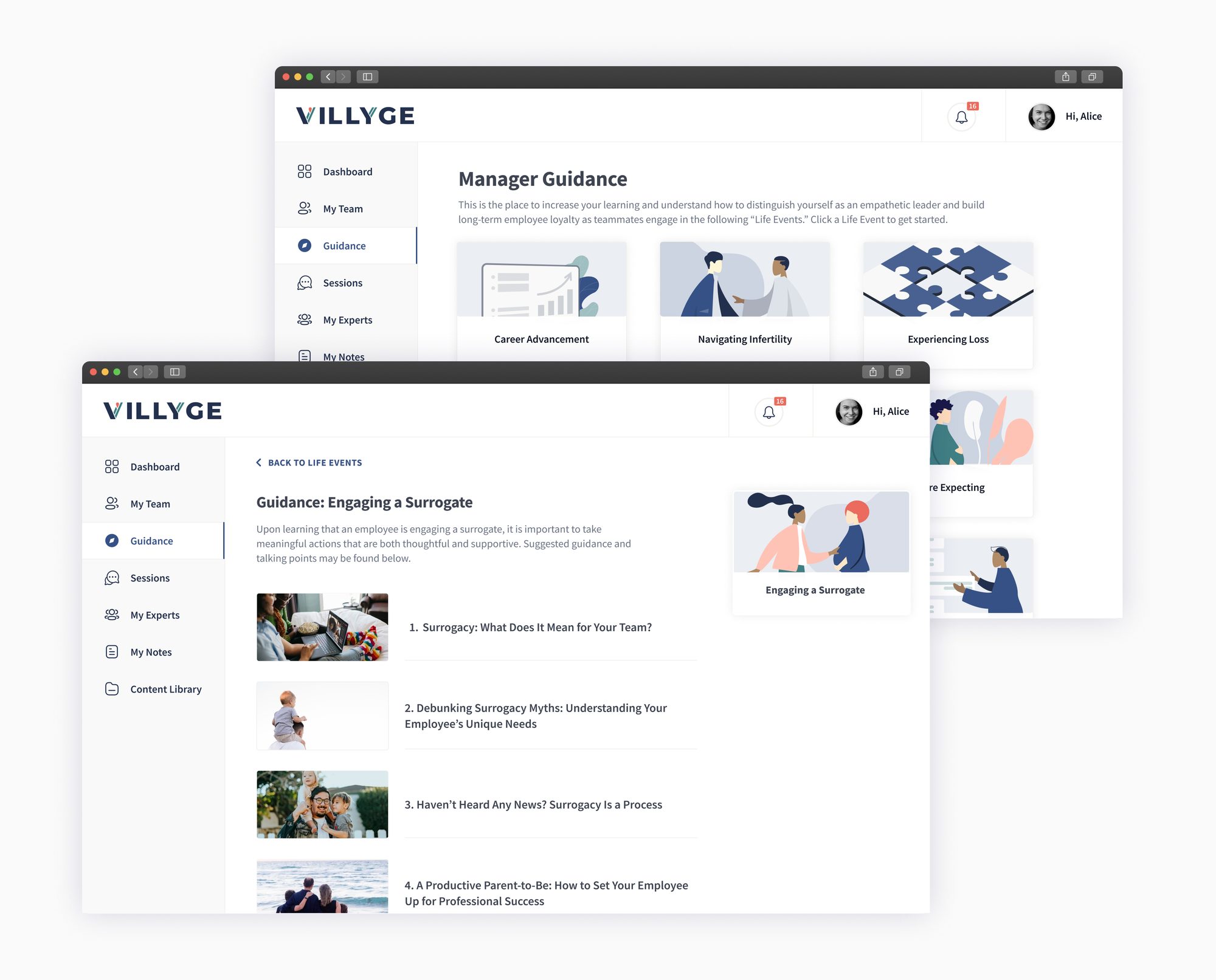
Clicking "See Checklists" from a dashboard nudge opens a step-by-step guide for that exact life event — staged from the moment a manager finds out through the employee's return.
Milestones from first notice to return.
Complete vs. overdue, at a glance.
Email drafts ready for each life event stage.
A separate tab holds short guides on every life event a manager might face — pregnancy, adoption, elder care, loss, and more — so a nudge always has somewhere deeper to send them.
Before shipping, we ran three moderated usability sessions on the live product. Each participant walked through the same core path: onboarding, sharing a life event, finding and booking a coach, then reviewing their sessions afterward.
Rather than treating each session as a one-off list of feedback, we mapped every session into an empathy map, split into four parts:
Splitting it this way let patterns across participants surface quickly — instead of getting lost in three separate sets of notes.
Lisa's "Finding an expert flow" session surfaced the most actionable insights of the three — several of the conclusions below shipped directly as a result.
The hardest part wasn't the interface — it was deciding exactly what each side of this relationship gets to see.
Villyge shipped as a B2B benefits platform with three live sides — employee, manager, and expert — each running on the same underlying event, filtered to what that person is actually allowed to know.