Case study 02 · Product design
Airline Ticket Search,
Mobile Redesign
Two very different travelers. One booking flow that assumed everyone was the same.
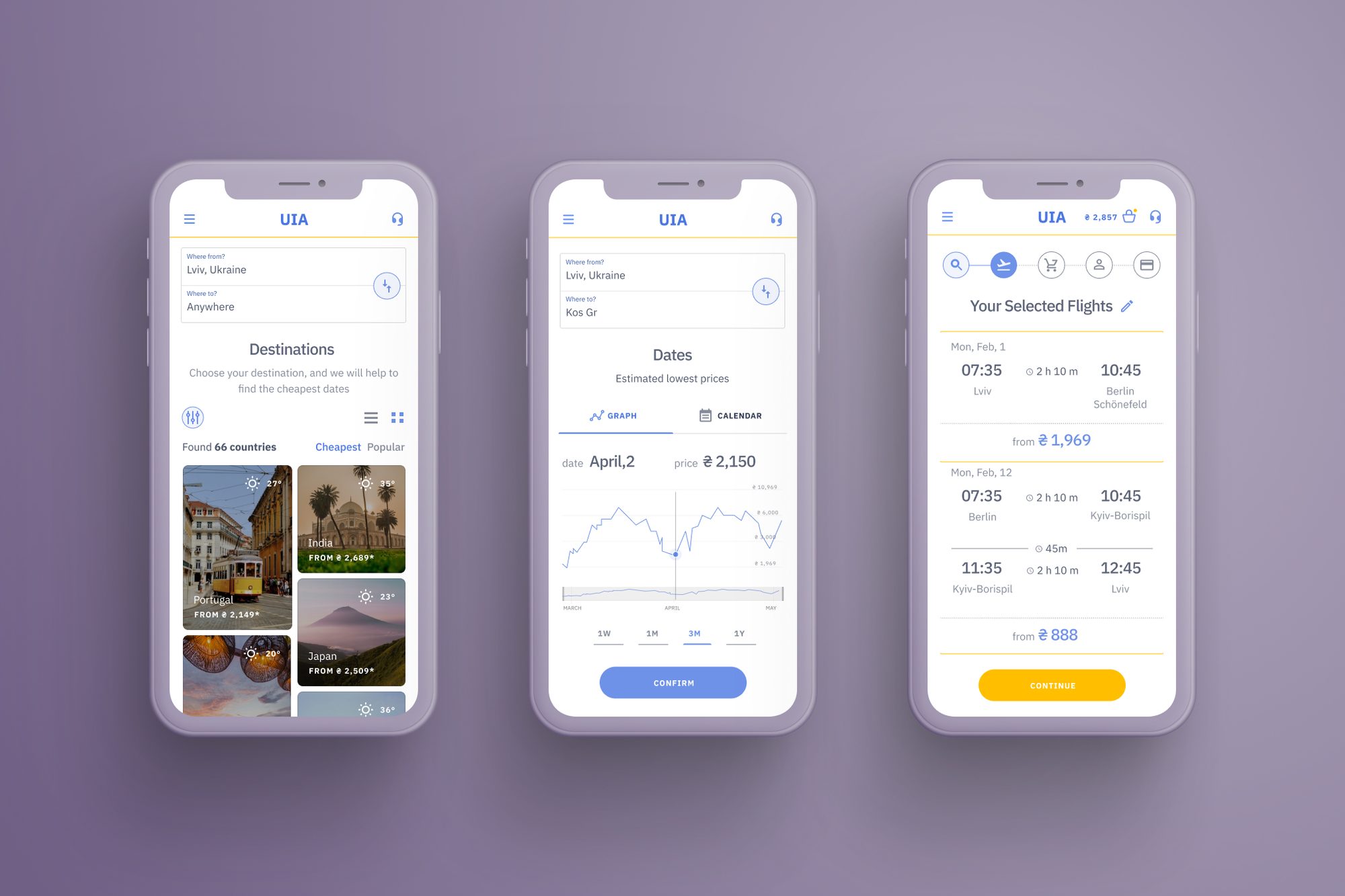
One search flow. Two very different travelers.
flyuia.com is Ukraine International Airlines' booking site. Three frequent flyers were interviewed about how they actually book flights, and 15 competitor sites were reviewed against it. The site had a single flow, built around one assumption: the traveler already knows where and when they're going.
Inspiration-first
No fixed destination. Flexible on dates. Decides based on price and mood, not itinerary.
Task-first
Destination already known. Booking under time pressure. Often interrupted mid-task.
Neither was supported.
There was no way to search without a destination. The booking flow had no tolerance for interruption: sessions expired, forms reset, and a return ticket could be booked by mistake with no clear way to correct it.
This redesign addresses both patterns directly, rather than optimizing a single default flow.
A third pattern — returning users needing check-in or booking support — surfaced in research too, but sits outside this redesign's scope.
Three interviews. Fifteen competitors. One pattern.
Research grouped site usage into three distinct interactions — not just "two travelers," but three separate jobs the site needed to support:
01
New user
Search, book, and plan a flight. Maps to Paul.
02
Existing ticket holder
Check-in, manage booking, flight status. Out of scope for this redesign.
03
Exploring
Best offers, inspiration, no fixed plan. Maps to Maria.
Methodology
Interviews
Three frequent flyers (Maria, Radislav, Paul) — semi-structured questions on how they actually search and book, not how they're assumed to.
Competitive teardown
11 airline sites ranked above flyuia.com, each evaluated on three lenses: functionality, hierarchy, visual style.
Synthesis
Findings sorted into must-have, nice-to-have, and idea tiers — separating baseline expectations from real differentiation.
Required by the competitive teardown
All three described the same workaround: search on a third-party site like tripmydream or Kiwi to find the actual routes and prices worth booking, then finish the purchase on the airline's own site — because the airline's own search couldn't do what they actually needed it to do.
One wants inspiration. The other wants speed.
Maria, 28
Artist · Kharkiv, Ukraine
Traveling is part of how she works — it's where inspiration and new ideas come from. She's flexible with destinations and dates, and treats planning a trip as part of the creative process, not a chore to get through.
Story
Maria opens the app with no destination in mind — just a window of free time and a budget. She enters "anywhere" for the whole month, sorts by price, and selects a vacation type. She chooses a country spontaneously, then finds the cheapest date on the price graph.
Obstacles
- Can't search by country on most airline sites
- Fees stay hidden until late in the flow
- Data resets if she steps away mid-session
User story
As someone with no fixed destination, I want to type "anywhere" directly into the destination field, so that flexibility is my starting point — not a fallback after a failed search.
Paul, 26
Fashion designer · Kiev, Ukraine
Travels constantly for work and inspiration, and rarely with much notice. Booking happens between other tasks — mid-meeting, mid-commute, mid-everything — so anything that assumes his full attention is going to lose it.
Story
Paul suddenly finds out he needs to fly to Berlin immediately, mid-meeting. He interrupts himself constantly while booking. He restarts the flow more than once because the session ends when he steps away.
Obstacles
- Unclear what information each form actually needs
- No clear sequence of steps to follow
- Can't see available data before he's asked to choose
User story
As someone booking under time pressure, I want one-way or return chosen before entering any data, with a visible booking-status stepper, so that an interruption never costs me the whole form.
Paul's actual flow, mapped step by step.
Before redesigning anything, the current flow was walked through exactly as a rushed, interrupted user would experience it.
Searches "Lviv to Berlin" on Google mid-meeting
Interrupted immediately after tapping the result.
Lands on the homepage, expects a pre-filled search
Instead sees a generic first screen — has to start over.
Page loads with one flight already selected
Confusing: he didn't choose it. Taps the price anyway.
An account authorization pop-up appears
He closes it — he wanted to book as a guest.
Session-timeout modal appears
The interruption cost him the flow. He starts again.
Types return dates by default
The site defaults to "return" — he only wanted one-way.
Corrects the setting, has to re-enter his data
Every correction costs a full re-entry, not just a fix.
Buys what he thinks is one ticket
It was two one-way tickets — the return step wasn't visually separated.
Eight steps. Four points of friction that had nothing to do with finding a flight.
The old structure repeated. This one doesn't.
Before touching any screen, the underlying structure was rebuilt first. In the old site map, features like baggage, seats, insurance, and hotel booking each appeared twice — once under booking a new flight, once under managing an existing one — because those two jobs had never been separated. The fix was consolidating each into one shared place that both flows could point to.
BEFORE
- Baggage, seats, and insurance each duplicated across separate booking paths
- Hotel booking and travel insurance repeated under multiple parent flows
- No dedicated entry for flexible or destination-less search
- Booking and post-purchase support mixed into the same navigation
AFTER
- One linear booking stepper: Time & Fare → Flight Options → Baggage → Personal Info → Payment → Confirm
- Each item appears once, owned by a single flow
- "Fly anywhere" added as a dedicated top-level entry
- "Graph with prices & dates" added as its own destination-discovery entry
The two new entries — fly anywhere and the price graph — map directly to what research surfaced. They weren't obvious extensions of the old structure; they needed their own place in it.
Two flows for two mental models.
Driven by speed
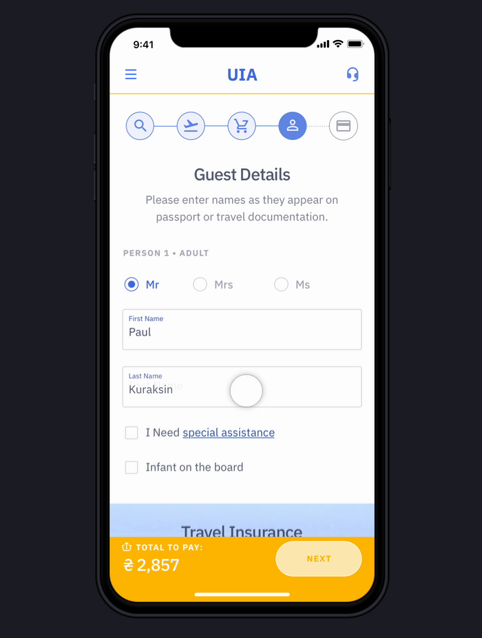
Flow 1 — Traditional booking, driven by urgency
One-way and return, clearly split
Two visually separated steps, not a single toggle easy to book past by accident.
Session survives interruption
Form data persists through an interruption instead of expiring and forcing a restart.
Booking status always visible
A persistent progress indicator so a distracted user always knows exactly where they are.
"I constantly take a million cases at one time. I usually decide to find and buy a ticket very spontaneously, sometimes even on the way to the airport."
Paul · user interview, 2019
More screens from this flow
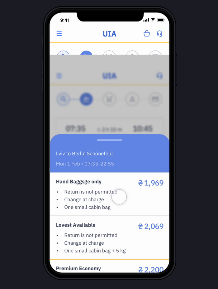
Flight results & baggage selection
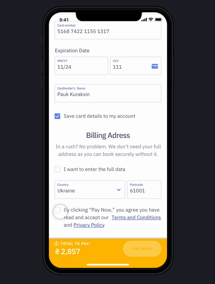
Payment — billing address
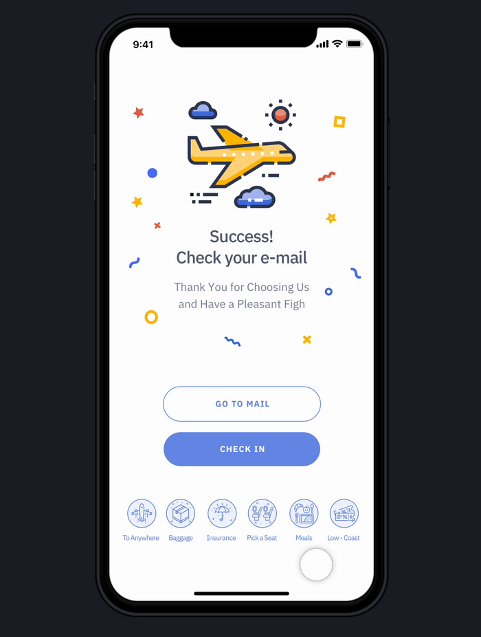
Confirmation — success screen
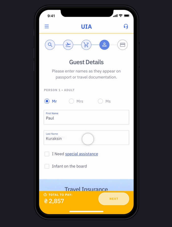
Guest details form
Driven by inspiration
Flow 2 — Anywhere & open-ended search
"Anywhere" as a destination
The origin field accepts "anywhere" as a real answer, not just a placeholder.
Whole month, not one date
The date picker offers "whole month" alongside specific dates for open-ended trips.
Filter by feeling
Leisure type, visa, and geography narrow inspiration — not just search results.
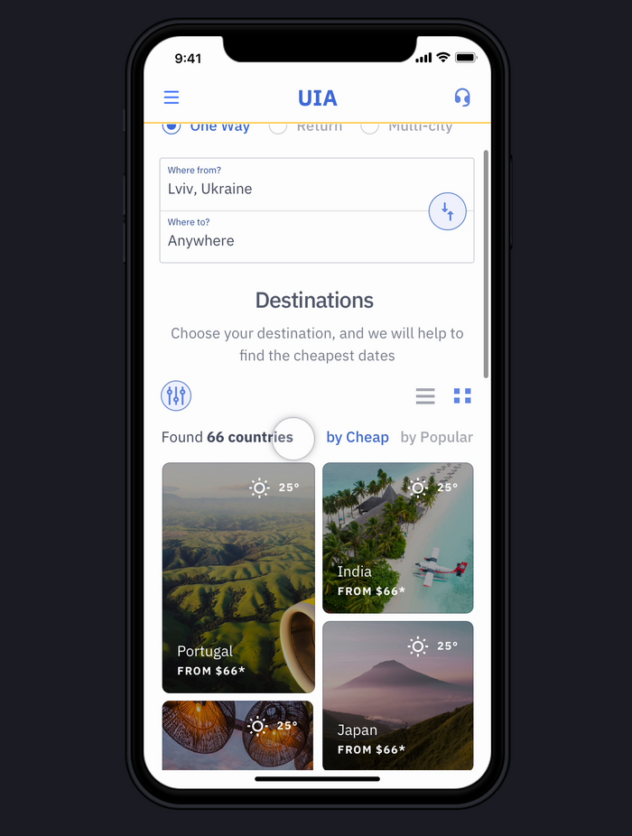
None of the 11 competitor sites reviewed visualized price against date this way — most offered a calendar at best.
"On tripmydream, it's an ability to search to anywhere destination. You really type: 'anywhere'. And then with the help of filters, you choose the best option for you."
Maria · user interview, 2019
More screens from this flow
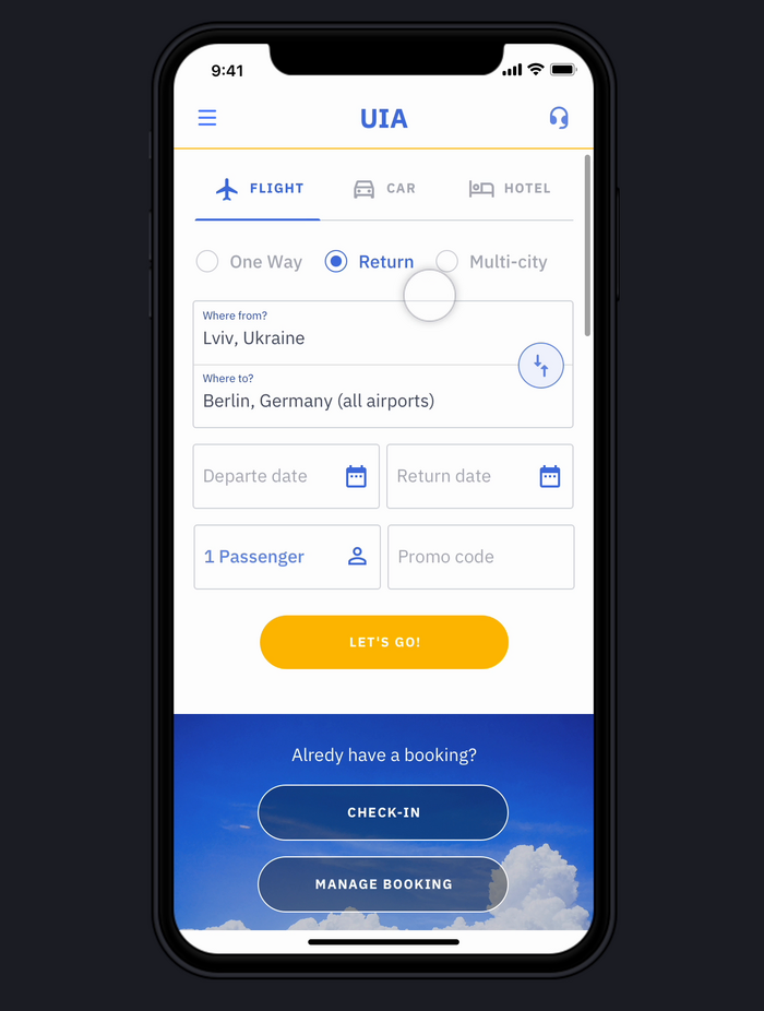
Origin/destination search form
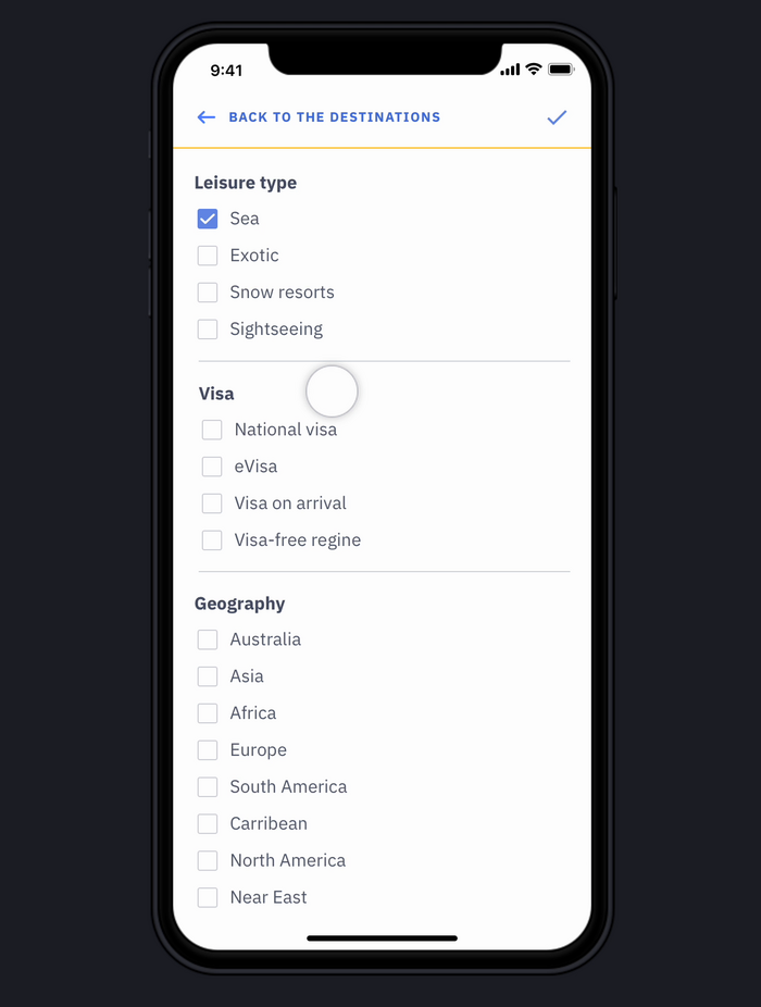
Filters — leisure type, visa, geography
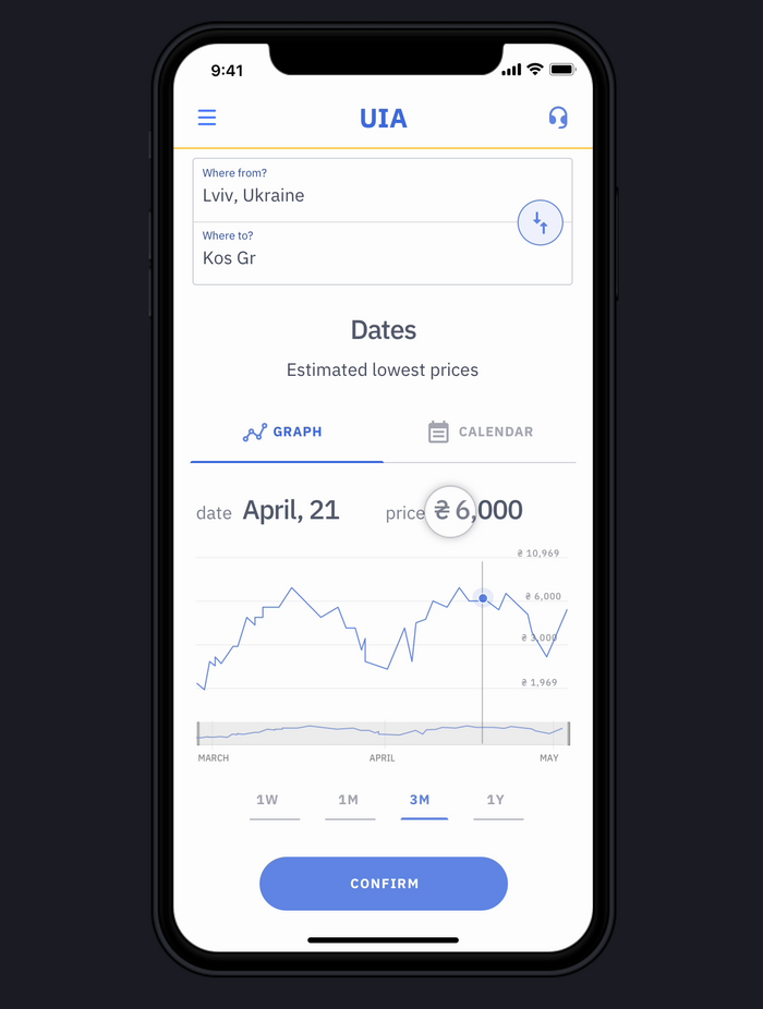
Price graph across the month
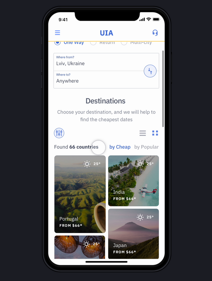
Destination grid — photo results
Maria and Paul never open the same screen first. That was the actual constraint — not a visual style or a component system, but a booking flow that has to recognize which of two people showed up before it decides what to show them.
The fix wasn't adding options to one flow. It was splitting the entry point itself — search-first for a destination already known, discovery-first for one that isn't — and letting both paths converge back into the same stepper once a flight is actually chosen.
What's untested here is real-world friction: whether "anywhere" search gets used at the volume the interviews suggested, and whether a persistent stepper survives a genuinely bad day of interruptions.
Next step would be putting this in front of five more travelers and watching exactly where they get stuck.