Case study 04 · Brand identity
Visual Identity
Starting from a single symbol, developed into a full visual language.
Case study 04 · Brand identity
Starting from a single symbol, developed into a full visual language.
I inherited just two things: an existing logo and a single typeface. Everything else — the style guide, the visual language, the concept holding it together — had to be derived from those two starting points rather than invented freely.
Software
The logo shape was designed to create an optical illusion that allowed the perception of a curved surface in either direction. This concept served as the foundation for brand development.
Primary GothamPro
Badges
Using the Gotham Pro black font, I crafted shapes that correspond to the initial letter on the employees' badge.
Industries
Data Science, Fintech, and the Internet of Things are three industries for which the company develops software. The illustrations below were used for print production and website design for these industries.
Application
The same visual language carries into a real applied screen — a billboard mockup showing the identity beyond the logo, type ramp, badges, and icon set.
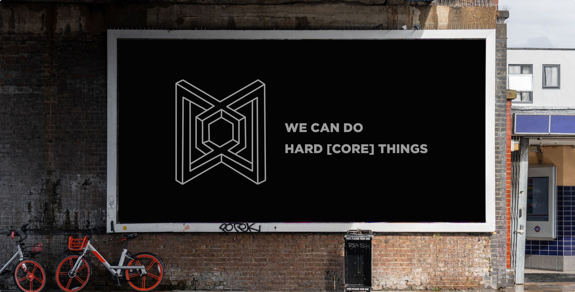
The same optical illusion — perceiving depth in a flat shape — became the principle behind the whole identity.
Typeface, badges, and icon set all carry that one idea forward, merging a set of separate elements into a single visual language.